
With pale tints and soft hues, pastel colours are emotive yet subdued, striking but simple. In the home, they’re an extraordinary way of expressing your personal style in a timeless way
Pastels seem to have a timeless appeal. From the Renaissance period, with artists such as Leonardo da Vinci and Michelangelo and the Pastel Movement in the early 20th century, to the boom of modern graphic design in the 1980s, pastel colours have been a cornerstone of artistic expression for countless generations. In interior design, it’s no different. Over the decades, we’ve seen an ebb and flow of pastels in various hues. More recently, in the wake of the Mid-century Modern interior design movement, pastels once again reached the peak of modern design. Often hailed as the ‘Millennial aesthetic’, everything from fabric and walls to glassware and ceramics have been adorned with these subtle yet calming hues. And there’s no sign of it going away any time soon.
Pastel Power
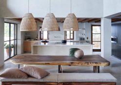
So what is a pastel exactly? It’s any colour with just enough white mixed into it, for it to appear soft and subtle. Don’t dismiss the effects of these white-washed hues – they may be understated, but still pack a punch. Pastels have a particularly powerful effect on the brain and eyes. On walls, these hues evoke feelings of calmness and can help reinvigorate dark spaces. With regards to decor and furniture, pastels boast immense versatility, blending with other colours and textures just as well as they highlight and accentuate them.
Pro Pastels
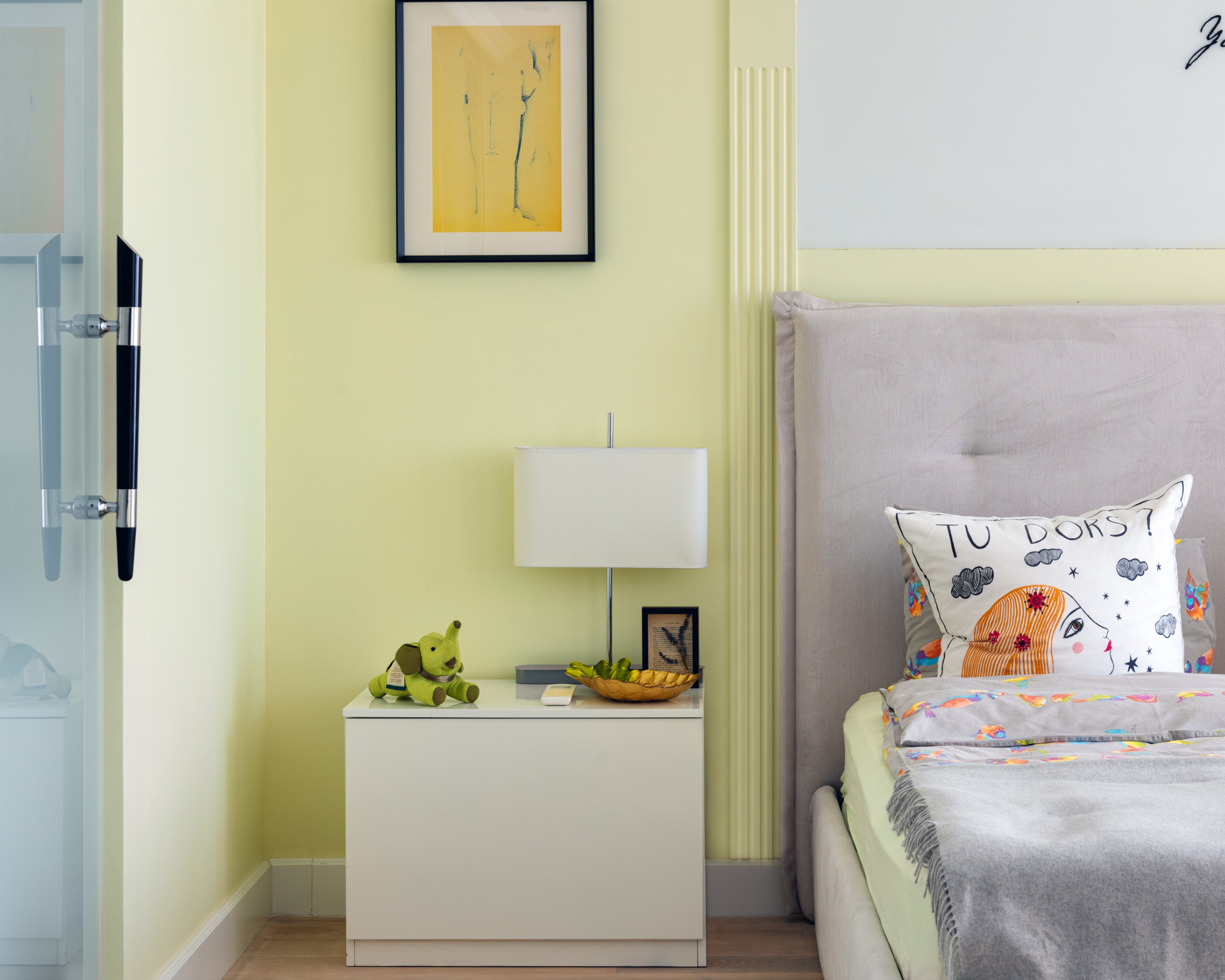
When it comes to pastels, balance is everything. Go too far, and the space will resemble a nursery or children’s room. Too much restraint, and pastels could disappear entirely. There are several ways you can achieve just the right amount: contrast, layers or monochromatic.
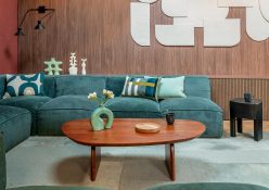
Contrast: The very best way to highlight pastel colours in a space is to contrast them with deeper, more saturated tones. Think Millennial pink with a dark bottle-green, or a buttery yellow with a deep navy blue. The starker the contrast, the more effective it will be in highlighting these softer tones. Feeling bold? You can even use black as a base and work your way up from there.
Layers: To add more dimension to pastels, consider creating layers of either print or texture. Thick woven fabrics bring new life to pastels, while throws in faux fur or metallic accents add an undeniable level of luxury. But one thing to be careful of is layering pastels on top of pastels, or layering them over white. Layering in this way will result in the space resembling a kid’s room, or taking on an Easter theme.
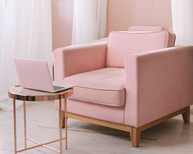
Monochromatic: If you’re ready to completely commit to a life of pastels, a monochromatic scheme makes a big impact. Imagine a soft Millennial pink couch in velvet, with blush-rose scatter cushions and a dirty pink throw – they can be a heavenly pairing if done right. Always consider the rest of the room, though, especially when incorporating these colours alongside more permanent fixtures such as wooden floors as this can sometimes create a clash. The best bet is to grab colour swatches and test them against your walls, floors, and furniture. Let your instincts guide you, and you won’t go wrong.
Pastel Palettes
There are literally hundreds of pastels to choose from but if you’re looking for a starting point, why not consider some of the most popular pastels of recent years. These are sure to stay on trend for seasons to come.
Quartz pink: A soft-hued pink is perhaps one of the trendiest colours to emerge in the last decade, and experts believe it’s here to stay. Striking and versatile, it quickly adds a playful yet sophisticated touch to any space.
Eggshell blue: This calming blue tone pairs beautifully with warm earth tones. So if you have wooden floors or exposed beams, this colour is a must.
Pastel green: Perhaps one of the more tricky pastel colours to incorporate in the home, this pastel shade should be contrasted with bolder colours.
Pastel yellow: Warm and playful, this tone of yellow brings life and interest to any space. Contrast this with a black to create a more serious mood.
Biscuit: Earth tones are as popular as ever, and this stony shade is timeless and effortless. Pairing it with other darker browns and blacks will accentuate the softer side of this colour.
Mushroom: Neutrals are given a softer side when brought out in a pastel hue. This tone is seriously chic and will work well with black and metallic accessories.
Words by Edwain Steenkamp
Photography: Pexels